trenes.com
What did we do
Branding
Art Direction
Graphic Design
Brand Architecture
Not on wheels, on rails.
Not on wheels,
on rails.
What did we do
Branding
Art Direction
Graphic Design
Brand Architecture
Not on wheels,
on rails.

Trenes.com is a platform to search, compare and buy train tickets. An agile way to find the trip you want to make. When they knocked on the agency's door, they did it with the idea of strengthening their brand in social networks. They were aware that competition would become aggressive with the liberation of the Spanish railway market, and that they had to prepare for this new context.
This project fell into the hands of a team passionate about trains. One that could see beyond the current brand and offered the possibility to elevate, define, consolidate and relaunch it at a key moment: with all the long weekends in December and the usual Christmas homecoming.

Revolution
calls for
evolution.
Users have come to have different alternatives, not only of operators, but also of schedules, fares and services, among the latter, more choice of search engines and ticket purchase hubs. We needed to design a rebranding strategy that would reaffirm the confidence that users need when searching, choosing and buying. A new identity, modern, agile and optimized, according to the new platform and search engine of trenes.com.
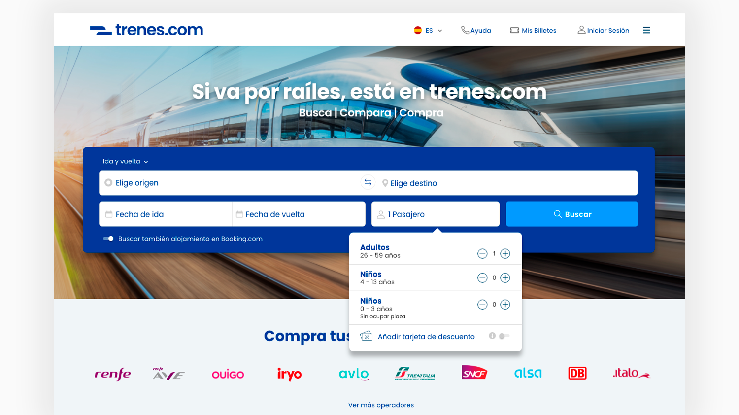
But before dismembering, stretching, touching and playing with the graphic identity, we defined the positioning strategy. Knowing what we were facing; knowing that the top players in the market were the same rail operators, we decided to capitalize on the great benefit that new users would enjoy: having everything in one place. With a key positioning message and through an approachable, clear and to-the-point tone of voice, what today is the brand slogan, was born: Si va por raíles, está en trenes.com (spanish for “If it goes by rail, it's on trenes.com").


UI: Better design,
even better experience.
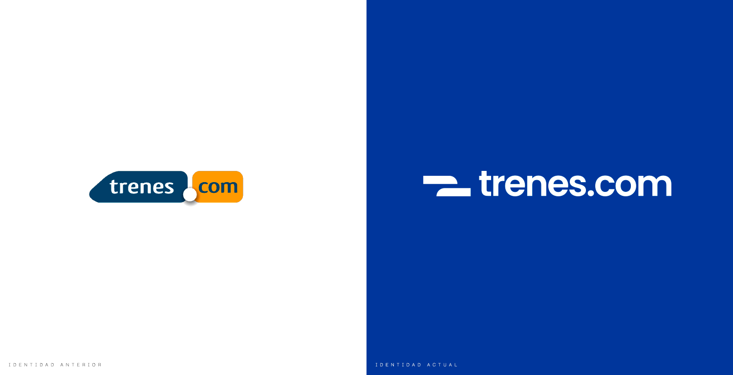
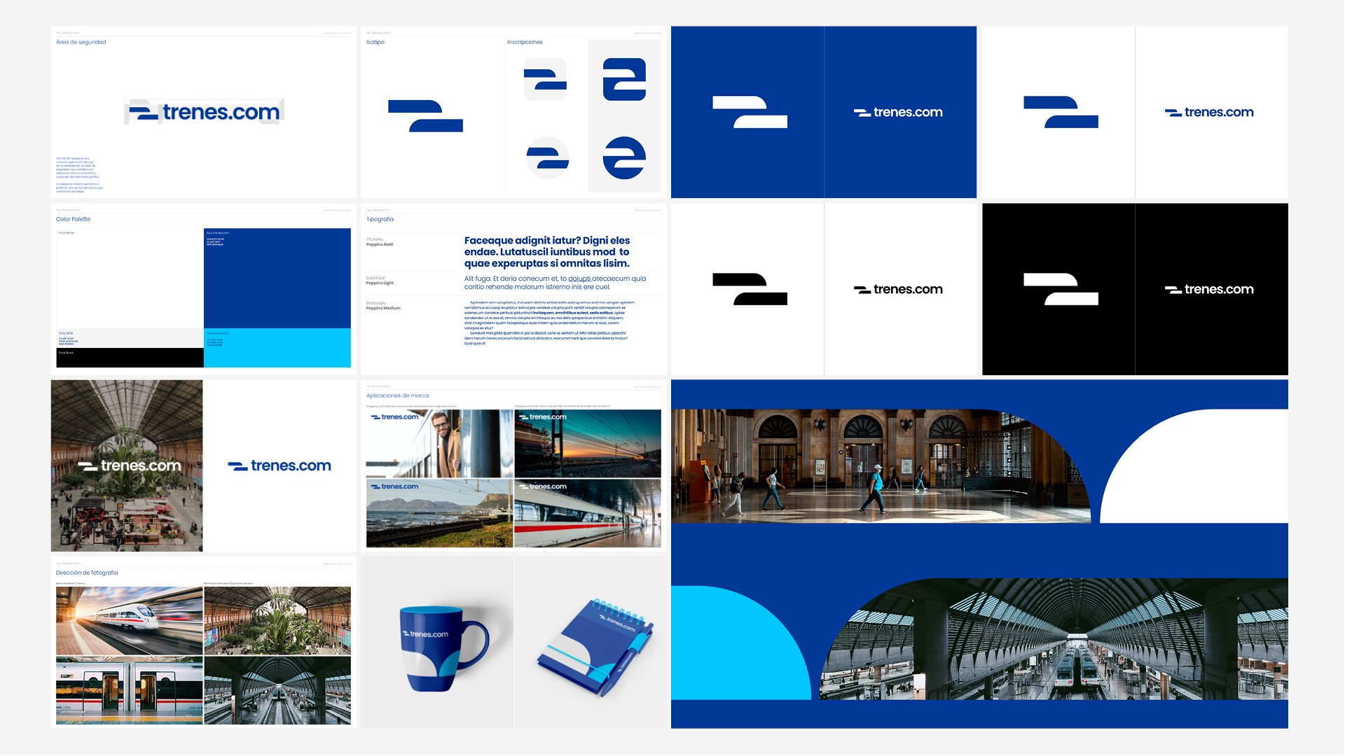
With the strategy in place, we started to reduce the brand logo. Optimize, simplify, summarize to its minimum expression. Two solid geometric shapes, a graphic synthesis of two trains. One that comes and another that goes. This minimal expression gives trenes.com a maximum of possibilities, perfect for any support, format and platform.
Its colors were still recognizable and associable to its previous identity, which made the brand evolution a natural transition for its current customers, but adding a second tonality to give it freshness. To give it even more depth and optimize it in terms of usability, we chose a digital native typography, web compatible. One that, by the way, looks great in the redesign we prepared for their website.
